Opinion PowerPoint Master and Slide Library
A new look
The Nuremberg market research institute OPINION had revamped its website with a new design. To ensure a consistent external presentation, the central PowerPoint masters for reportings and methods needed to be revised. A flexible design was required to effectively present complex, data-based content.
The design of the website and the presentation behavior of OPINION employees were analyzed. From this analysis, key elements for the redesign of the PowerPoint masters were derived. The strategic focus was on the emotional presentation of study and survey results.
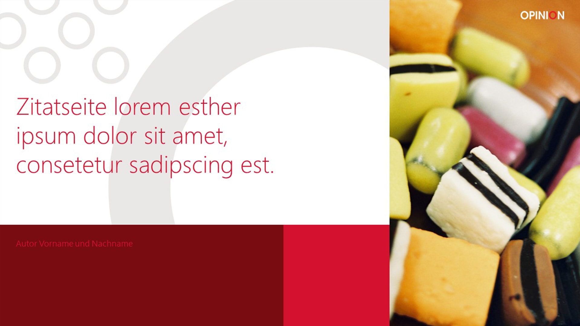
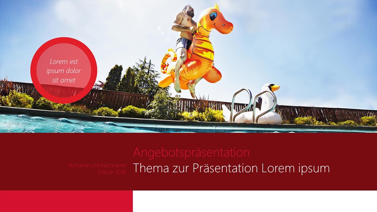
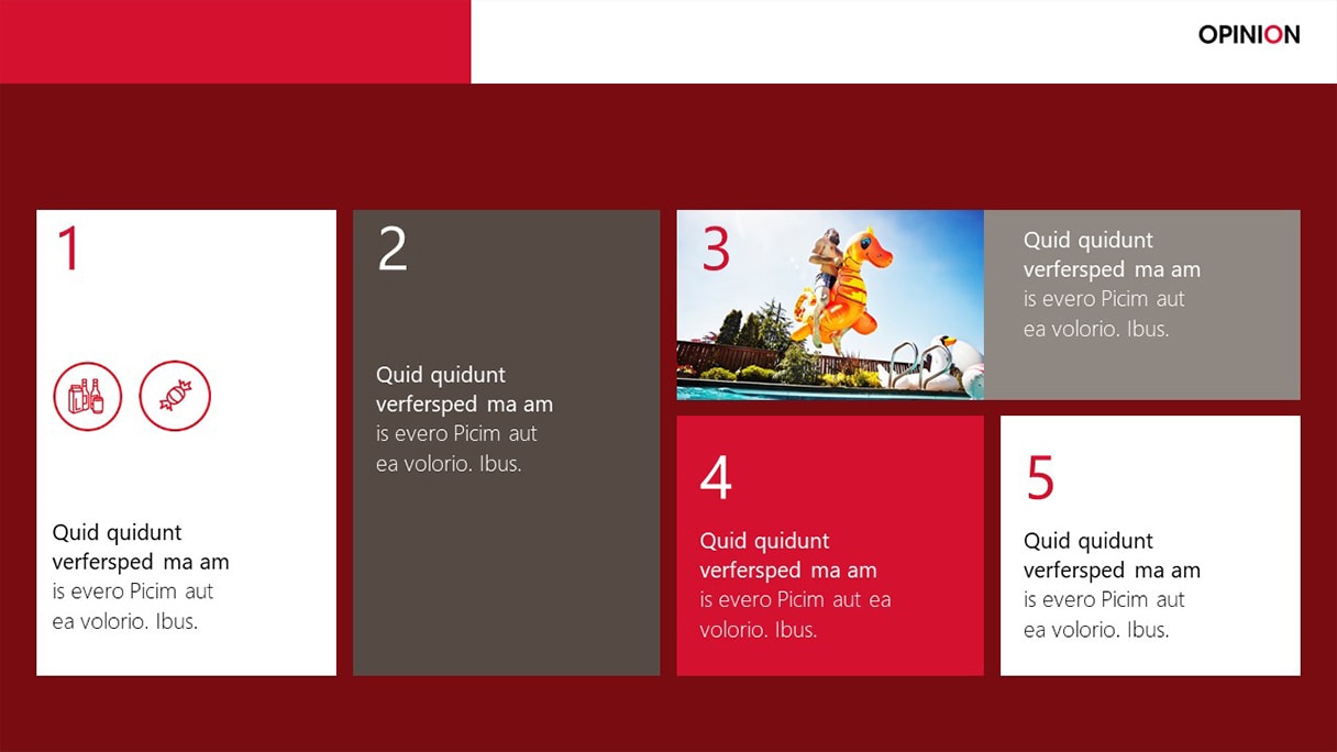
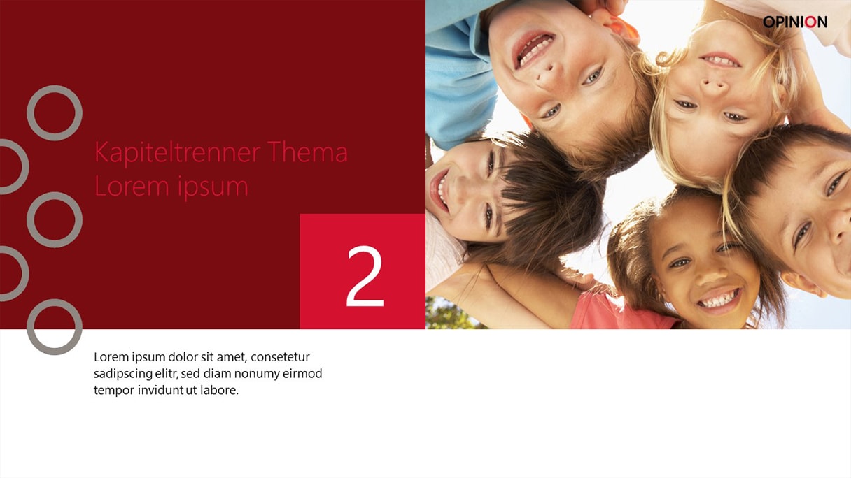
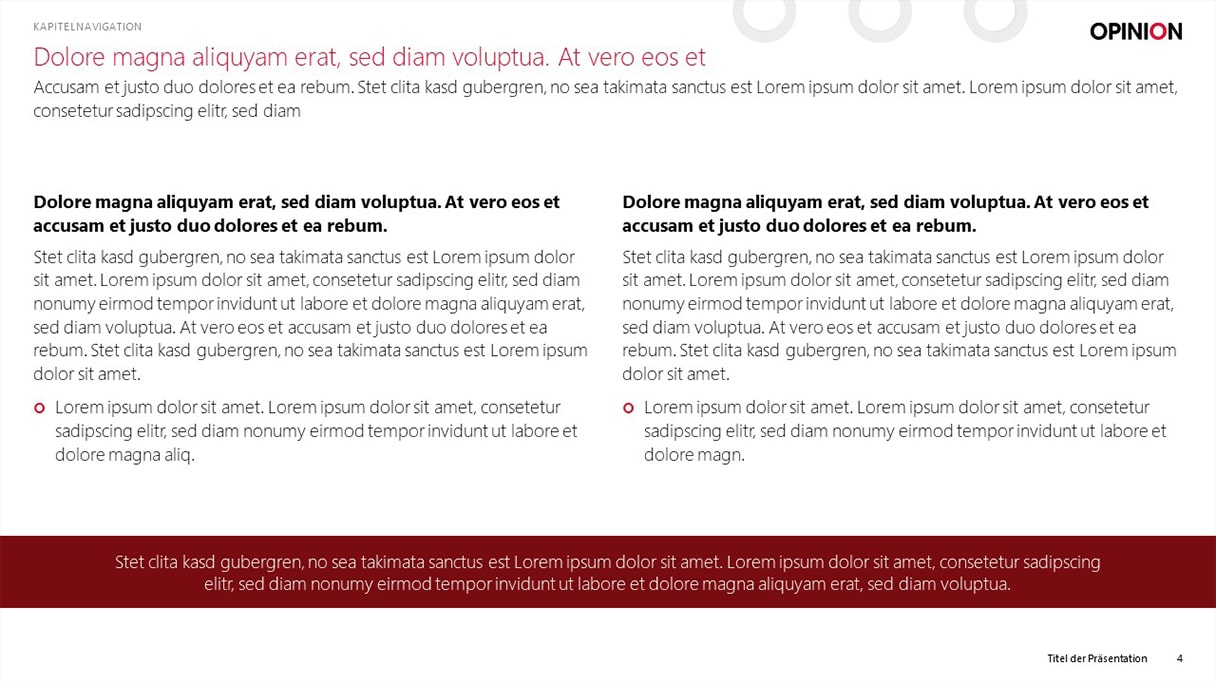
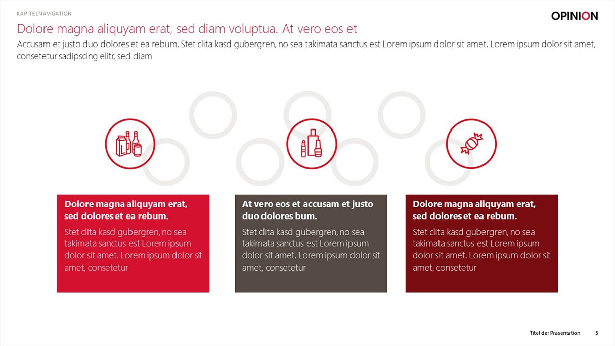
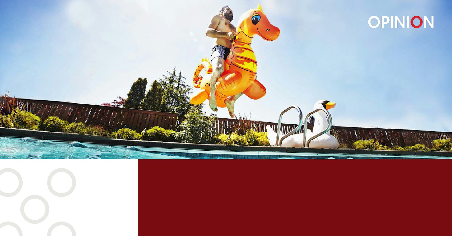
Two PowerPoint masters were created that hit the nerve of our client. The letter "O" from OPINION was turned into a playful design element. By using emotional, large-scale images, we brought diagrams, numbers, and facts to life. The combination of strong color fields with ample white space introduced balance and clarity to the visual appearance. The client was very happy with this outcome.
